
How to add text to a photo (with a drop shadow)
Add text to a photo online — set the font, size and color with the Type tool, then make the words readable on any background with a classic drop shadow.
Text sitting straight on a photo often disappears into the background. The fix is the classic combination: white (or solid-colored) type plus a soft drop shadow that separates the letters from whatever is behind them. Here's the whole workflow in PhotoFresco, free and in your browser.
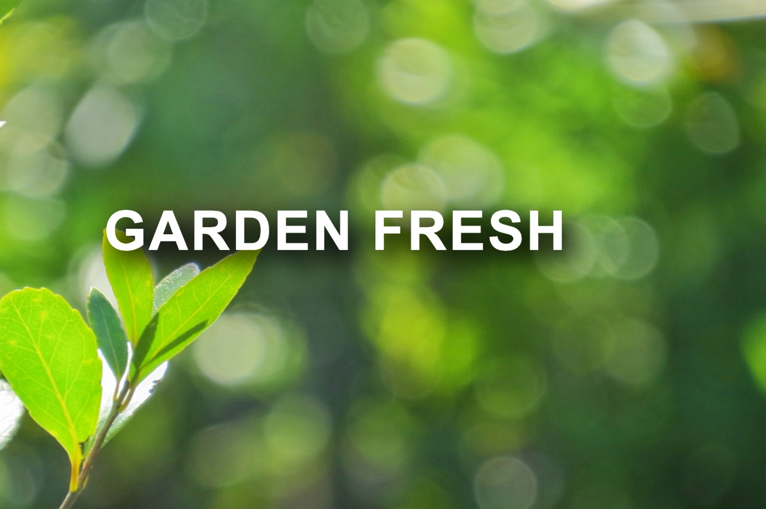
Add text with a drop shadow in four steps
- Open your photo (
File ▸ Open…), then pick the Type tool (T). - Set the font, style, size and color in the options bar, then click on the canvas and type. A click gives you a free-standing line; dragging first draws a text box that wraps lines to its width.
- Commit the text by clicking away from it (or
⌘Enter / Ctrl+Enter). To reposition, switch to the Move tool (V) and drag. - Open
Layer ▸ Layer Style ▸ Layer Style…(or double-click the empty part of the text layer's row in the Layers panel), tick Drop Shadow in the effects list, and tune it with the live preview on. Click OK — the whole styling session lands as a single undo step.
Layer styles apply directly to the live text layer — no rasterizing, no compromises. The text stays fully editable: retype it, resize it, change the font, and the shadow follows.

Dialing in the shadow
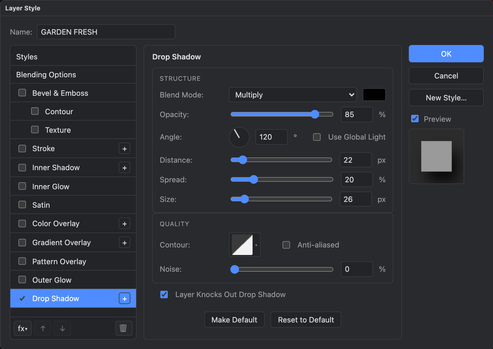
The hero image above uses Opacity 85%, Angle 120°, Distance 22 px, Spread 20%, Size 26 px on a black shadow — a good starting point for headline-size text. What each control does:
- Opacity — how dark the shadow is. Busy, high-contrast backgrounds need more than calm ones.
- Angle — the light direction; the shadow falls opposite it. 120° (light from the upper left) is the Photoshop-classic default.
- Distance — how far the shadow is offset from the letters. More distance reads as text floating higher.
- Spread — how much the shadow expands before blurring. A little spread makes a bolder halo, which helps small text.
- Size — the blur. Small = crisp and graphic; large = soft and subtle.
The shadow is a live layer style on a live text layer: reopen the dialog any time to change it, keep editing the words underneath it, and it survives PSD export intact. You can stack more than one Drop Shadow with the + button, and add a Stroke from the same dialog for an outlined-sticker look.
Tips
- White text + black shadow works on almost any photo. For dark, moody images, try the inverse: black text with a soft white Outer Glow.
- Legibility comes from contrast, not size — a modest headline with the right shadow beats giant unshadowed type.
Type ▸ Rasterize Type Layerstill exists for pixel-level work (painting into the letters, filters); the layer style survives rasterizing, but the text stops being editable — style first, rasterize only when you need pixels.
Last updated